


K A P O O P
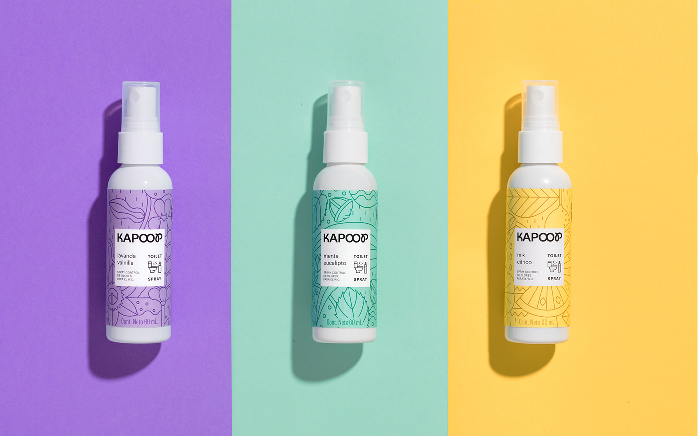
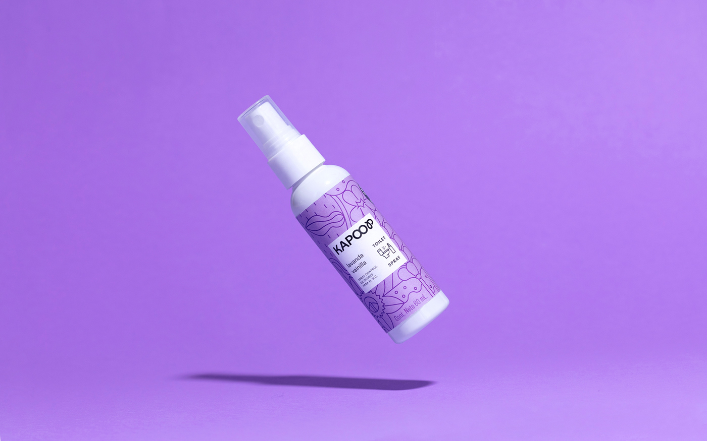
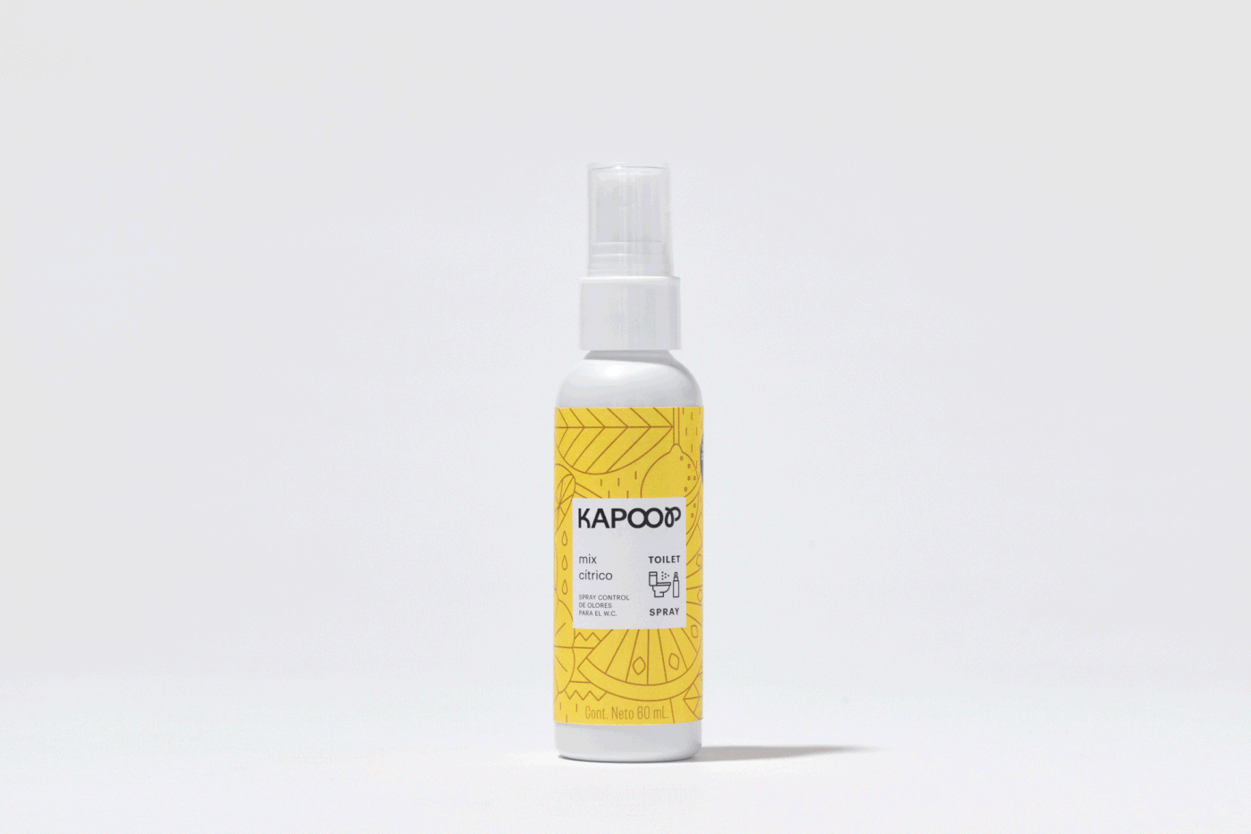
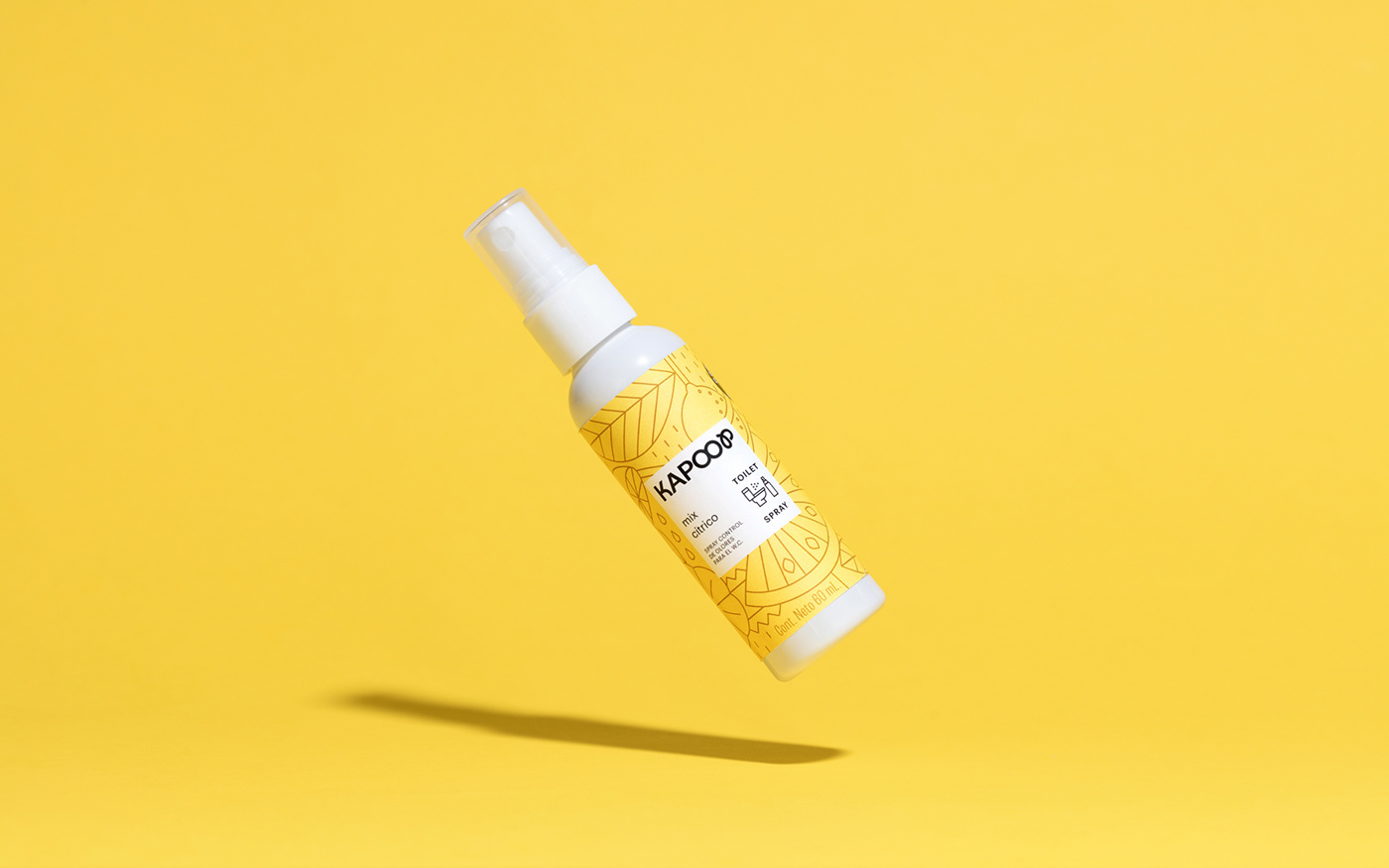
Kapoop is a bathroom spray that blocks bad odors. Since pooping is still a taboo in Mexican culture, we made the packaging design to be minimalistic, discrete, and focused on the smell of each product variation. To accomplish this, we made outline illustrations and applied them in fresh color palettes while giving the main focus of the design to the brand and product information in a centered and traditional composition. This also allows the brand to expand in the near future in case new scents are made.
For the logotype we made a custom, bouncy typeface which looks both fun and edgy while serious and even medical. We also designed an icon which combines the idea of a thumbs up with the shape of a toilet seat. This icon fits perfectly with the laid back voice and tone the client desired.
We came up with the brand slogan “todo saldrá bien” which is a variation of a phrase that sometimes people use in Mexico when people go to the bathroom, it means both “everything will be fine” and “everything will come out smoothly” in reference of the art of expelling out digested food.
For the product photography, we took very minimalistic images that allow the product to be the main character and evoke feelings of cleanliness and fresh scents while making subtle references to the bathroom imaginary through bubbles and tiles.
C R E D I T S:
Art Direction: Mariela Mezquita // Graphic Design: Valentina Villa, Leslie Piñón // Motion: Luis Romero
Photography: C129 // Styling: Mariela Mezquita, Valentina Villa // Client: Kapoop through Zebrands


